Section 11 Self-Organizing Map (SOM)
Under this menu, you can combine clustering and data visualization by displaying your data on a map
- Project your data on clusters arranged on a map (perfect for exploration of the typology of the individuals)
- Explore your map by displaying levels of the variables on the map
- Simplify your map with super-clustering
- Extract clusters or super-clusters as a new dataset
The method used in ASTERICS comes from the package SOMbrero (Vialaneix et al. 2022) (Villa-Vialaneix 2017).
For further information on SOM method:
11.1 Run Self-Organizing Map
How to set options?
Set options to obtain results from the Self-Organizing Map algorithm:
topology can either be “square” (usually easier to interpret because the output plots always correspond exactly to the map organization) or “hexagonal” (usually advised topology because all units of the map has the same number of neighbors but output plots can sometimes be a bit distorted because hexagonal display is not supported for all types of plots);
map length and map width: correspond to the number of units of the map in two dimensions. If you have no a priori choice, you can keep the default values;
seed: SOM training involves a stochastic process and results can be different at each run. Setting this value ensures that you will be able to reproduce the exact same result (using the same seed). If you want to check that your results are stable, enter different seeds and explore the different maps obtained from each seed.
Important note: SOM is performed with raw values (data are not scaled to unit variance before they are processed). If you want to perform SOM on scaled data, go to the menu “Edit / Dataset edition” and scale your dataset before SOM.
11.1.1 Self-Organizing Map


The map should be understood as an organized clustering: each circle of the map is a cluster (also called a neuron or a unit) and its color and size are proportional to the number of individuals that it contains. The closer two clusters are to each other on the map, the more similar are the individuals from these two clusters.
11.1.2 Summary

Quality criteria:
topographic error: is a measure of how well the map is organized (i.e., if two clusters are close, can you trust the fact that corresponding individuals are similar?). This number is always between 0 (best possible organization) and 1 (worst possible organization), with 0 being the value expected for small maps;
quantization error: is a measure of the clustering quality (very similar to within-dispersion in clustering). This number is always non negative (the smaller its value, the better the clustering).
Correlation ratio:
This table displays the 20 first variables with the largest percentage of inertia reproduced by the clusters of the map. The largest the percentage of inertia, the more relevant the corresponding variable is to explain differences between clusters.
11.2 Explore individuals
11.2.1 Color

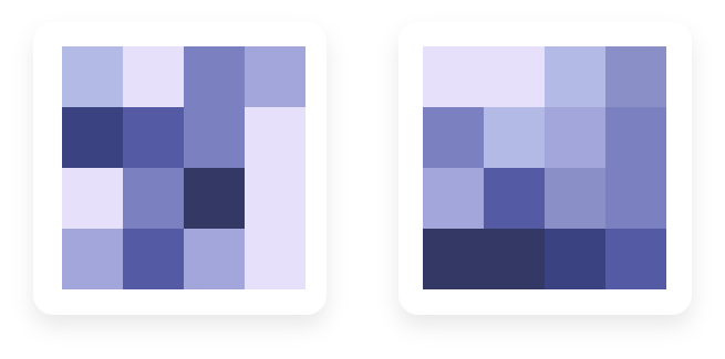
The color level represents the value of the selected numerical variable in the corresponding cluster. If colors are smoothly arranged on the map (as in figure on the right), it means that this variable has a strong impact on cluster organization. On the contrary, if colors are randomly it means that the selected variable is not useful to explain the map organization.
11.2.2 Boxplot
Similarly to “Color,” “Boxplot” can be used to identify differences in the distribution of up to five variables between clusters. They can help interpret clusters or understand the map organization.

To allow for several variables with possibly different scales to be displayed at once, note that variable values are centered to zero mean and scaled to unit variance in this plot.
11.2.3 Names
If the number of individuals in your dataset is no more than 100, the individual names (row names) can be directly displayed on the map.
11.2.4 Pie
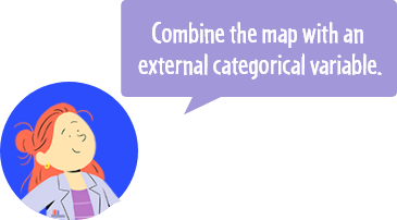
The pie chart represents the distribution of the selected categorical variable in the corresponding clusters. If pies tend to be mostly made of a individuals with the same level for the categorical variables (as in figure on the right), it means that this variable has a strong impact on cluster organization. On the contrary, if pies are composed of multiple levels (as in figure on the left), it means that the selected variable is not useful to explain the map organization.
11.3 Explore prototypes
11.3.1 Color

Prototypes are special individuals, representative of their cluster. They are approximately computed as centers of gravity of the individuals in this cluster.
The color level represents the value of the selected numerical variable for the cluster prototype. If colors are smoothly arranged on the map (as in figure on the right), it means that this variable has a strong impact on cluster organization. On the contrary, if colors are randomly scattered on the map (as in figure on the left), it means that the selected variable is not useful to explain the map organization.
11.3.2 Multidimensional scaling plot (MDS)

In MDS plots, prototypes should be roughly organized as in the original grid, up to rotation, symmetry or local distance distortions. A MDS plot as in the figure on the left indicates a good organization of the map, whereas a MDS plot as in figure on the right indicates a poor organization of the map.
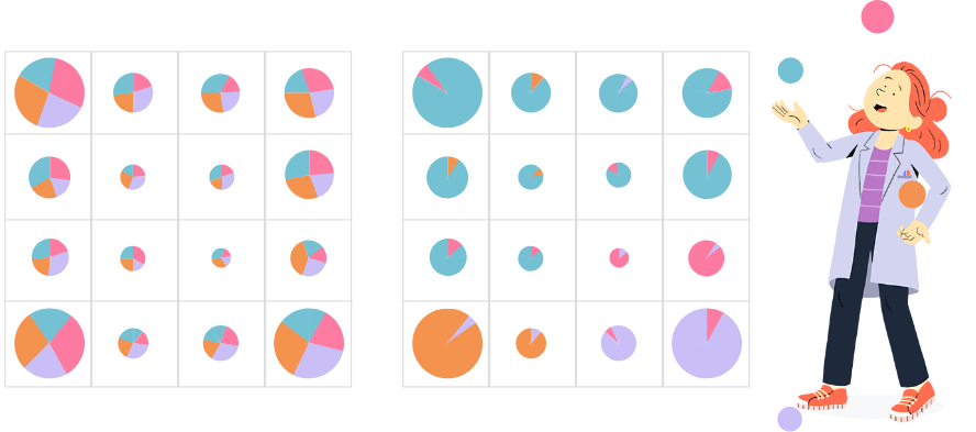
11.4 Distances with polygon
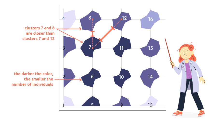
This plot can be used to represent distances between neighboring clusters and cluster frequencies:
distances between neighboring clusters are represented by the distances between polygons corners. For instance, in this example, clusters 7 and 8 are closer (their prototypes(*) are more similar) than clusters 7 and 12;
the number of individuals classified in each cluster is represented by the color level: the darker the color, the smaller this number.
(*) Prototypes are special individuals, representative of their cluster. They are approximately computed as centers of gravity of the individuals in this cluster.
11.5 Superclustering

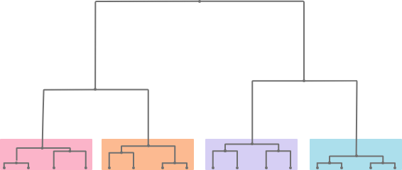
Superclustering is a hierarchical clustering performed on the cluster prototypes (tips of the dendrogram are thus prototypes)(*). It groups together similar clusters.
(*) Prototypes are special individuals, representative of their cluster. They are approximately computed as centers of gravity of the individuals in this cluster.
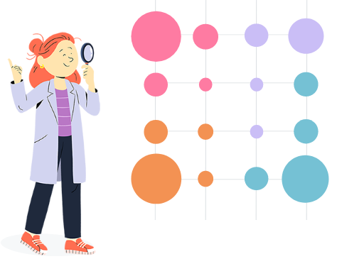
Colors on the map indicates to which super-cluster the corresponding cluster is
affected. Circle colors match the colors of the dendrogram and size of the circles
are proportional to the number of individuals classified in this cluster.
To choose the number of super-clusters, try to find a gap in the branch length evolution.