Section 7 Explore variables
Under this menu, you can explore the variables of your datasets, and obtain numerical summaries and plots for 1 to 5 variables, or batch analysis for an entire dataset:
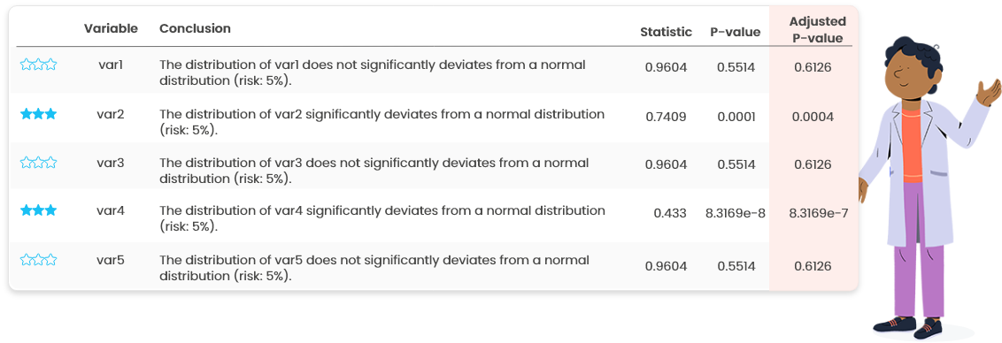
- Numerical summaries: min, max, quartiles, mean, standard deviation, correlation coefficients (for 2 variables), normality test, frequency and percentage for categories of qualitative variables
- Graphical outputs: barplot (for categorical variable), stripchart, histogram, boxplot, violin plot, density plot, scatter plot (for 2 and more variables) with various colors, symbols and shapes
- Batch analysis of all variables in a given dataset in which most of these numerical and graphical outputs are automatically included.
7.1 Univariate
7.1.1 Plots

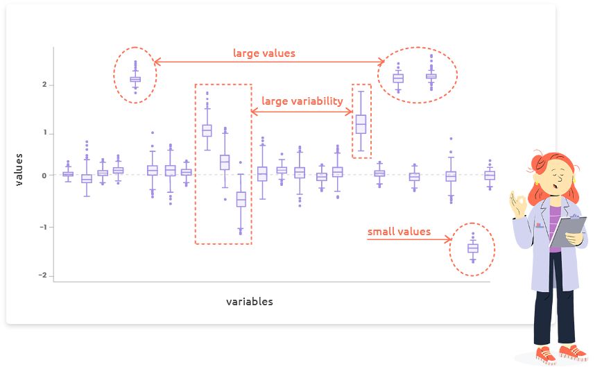
Stripcharts and boxplots (Figure 7.1) are useful to identify outliers. Outliers can be due to an error in data (in this case, correct them or remove the corresponding individual using the menu “Edit”). If they are not due to an error, check these individuals closer to understand why they exhibit such atypical values.
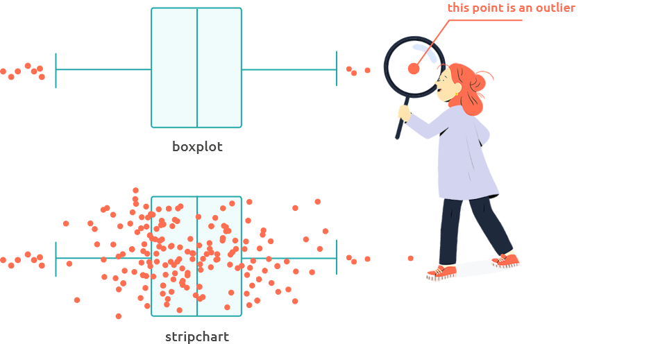
Figure 7.1: Stripchart and boxplot
Histograms, boxplots, violin plots and density plots (Figure 7.2) are useful to assess the symmetry of the distribution (Figure 7.3) or to identify multi-modal distributions. Asymmetric distributions or multi-modal distributions can indicate a deviation to gaussianity.
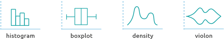
Figure 7.2: Histograms, boxplots, violin plots and density plots
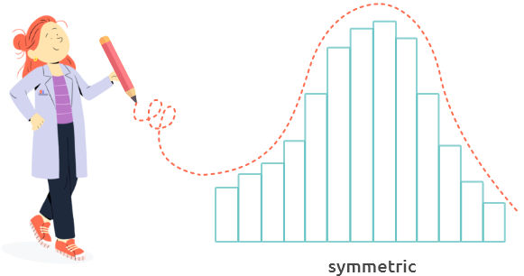
Figure 7.3: Symetric distribution
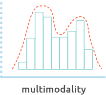
If the distribution exhibits a multi-modal shape, explore your variables along
with categorical variables to find if one can explain this distribution (panel
“2 variables”).
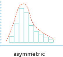
If the distribution is asymmetric and you need it to be symmetric (to perform a
Student test for instance), try a log-transformation from menu “Edit.”
7.1.2 Summary

How to interpret numerical summaries for numerical variables or categorical variables?
7.1.2.1 Numerical variables
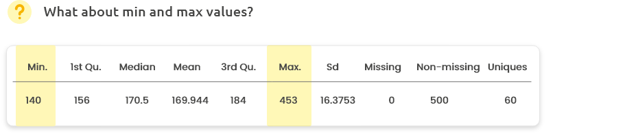
Are minimum and maximum values consistent with your knowledge? For instance, 453 cm is probably not relevant for the height of a Human. In this case, check and correct or remove these data (from menu “Edit”).
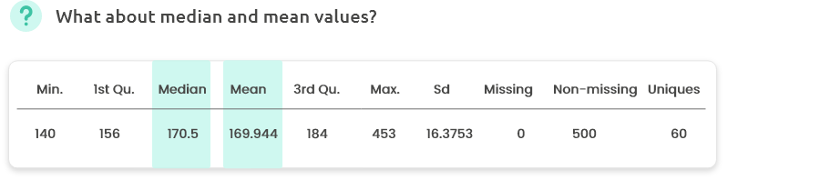
A difference between mean and median can indicate that the variable distribution is asymmetric. Check with the histogram, the boxplot or the density plot.
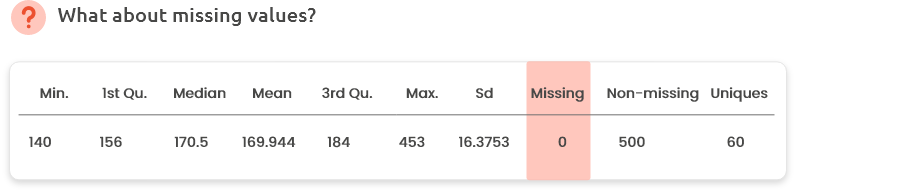
Did you expect missing values or not? If any, missing values can be explored and/or removed/corrected from Menu “Edit.”
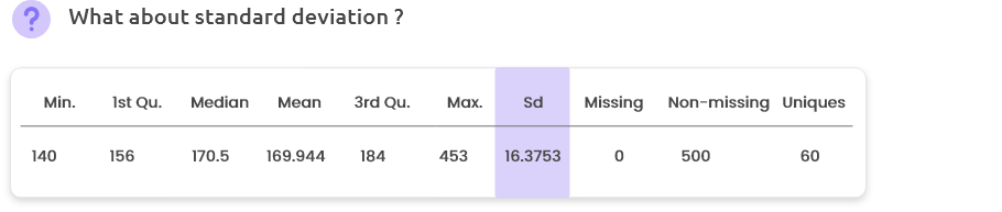
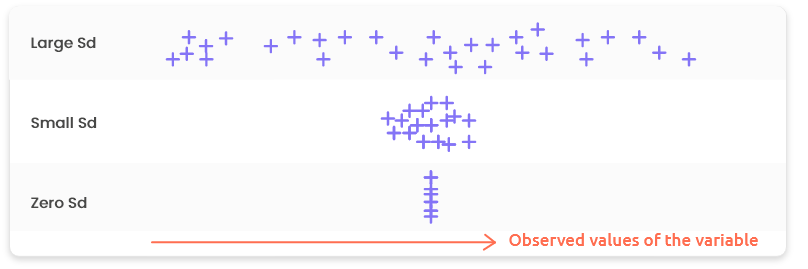
“Sd” is for Standard deviation. It is a measure of spread or dispersion and it tells us about the variability of the values around the mean. The higher the Sd the more scattered the values; the lower the Sd, the more concentrated the values. A Sd equal to zero indicates that all the values are equal (and are thus equal to the mean).
7.1.2.2 Categorical variables
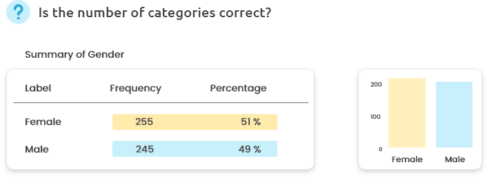
Is the reported number of categories correct? Did you expect such a distribution of individuals among categories? (Is it consistent with the design of your experiment?)
If you have many categories, the barplot can be useful to better assess their distribution. If you have one or several very rare categories (containing only a few number of individuals), you might want to recode them or to remove them from Menu “Edit.”
7.2 Bivariate
7.2.1 Two numerical variables
7.2.1.1 Plots
Scatterplots are useful to identify relationships between two numerical variables.

Depending on the shape of the scatterplot, the two corresponding variables can be seen as:
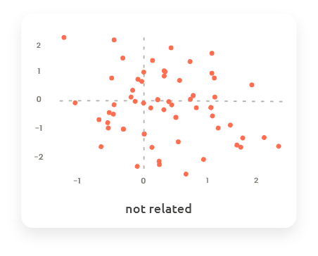
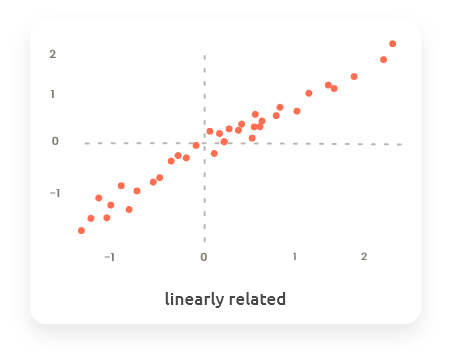
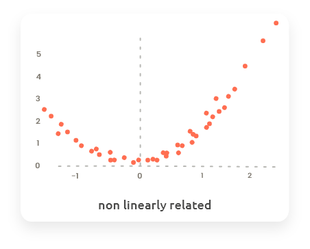
Scatterplots are also useful to highlight outliers.
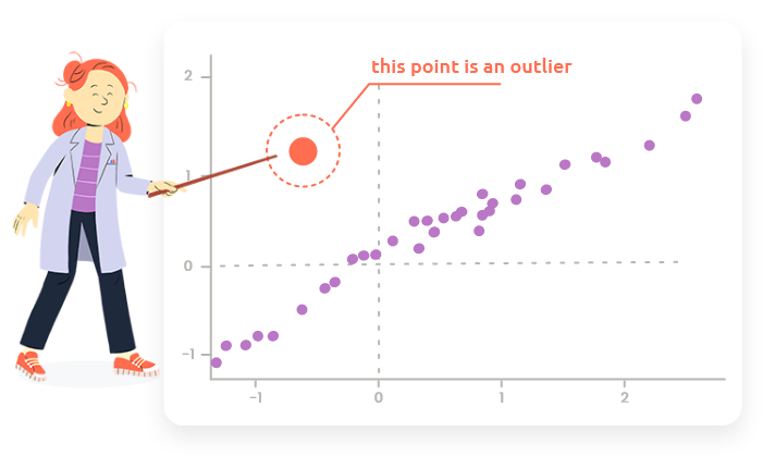
This type of point can not be identified as a outlier when only looking at one of the distributions of the two variables but it appears as an outlier on the scatterplot because it is outside of the trend between the two variables.
7.2.2 One numerical and one categorical variables
7.2.2.1 Plots
The plots are the same than plots obtained in tab “1 variable,” but displayed in parallel (stripchart, boxplot and violin) or superimposed (density), with respect to the levels of the categorical variable.
7.2.2.2 Statistical tests
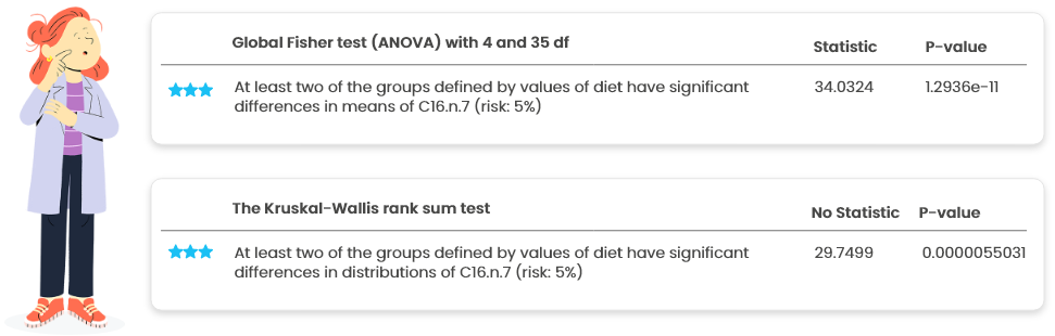
- The (global) Fisher test (ANOVA) tests the following H0 hypothesis: “For all the levels of the categorical variable, the average value of the numerical variable is the same.” This test is based on normality (Gaussian distribution) assumptions of the numerical variable.
- The Kruskal-Wallis test is a nonparametric test (that does not require gaussianity) that is an alternative to ANOVA. It tests (globally) the following H0 hypothesis: “For all the levels of the categorical variable, the distribution of the numerical variable is the same.”

If ANOVA and KW disagree (two very different p-values, one smaller than 0.01 and the other larger than 0.5), investigate to identify the reason of the mismatch (non gaussianity, presence of an outlier, …).
This plot (Figure 7.4) is a graphical output of the post-hoc tests
(tests performed on pairs of levels of the categorical variable when it has more
than two levels and if the global test for 1-way ANOVA is found significant).
The segments represent the confidence interval for each pairwise comparison: if
0 belongs to the interval the difference between the two means is not significant.
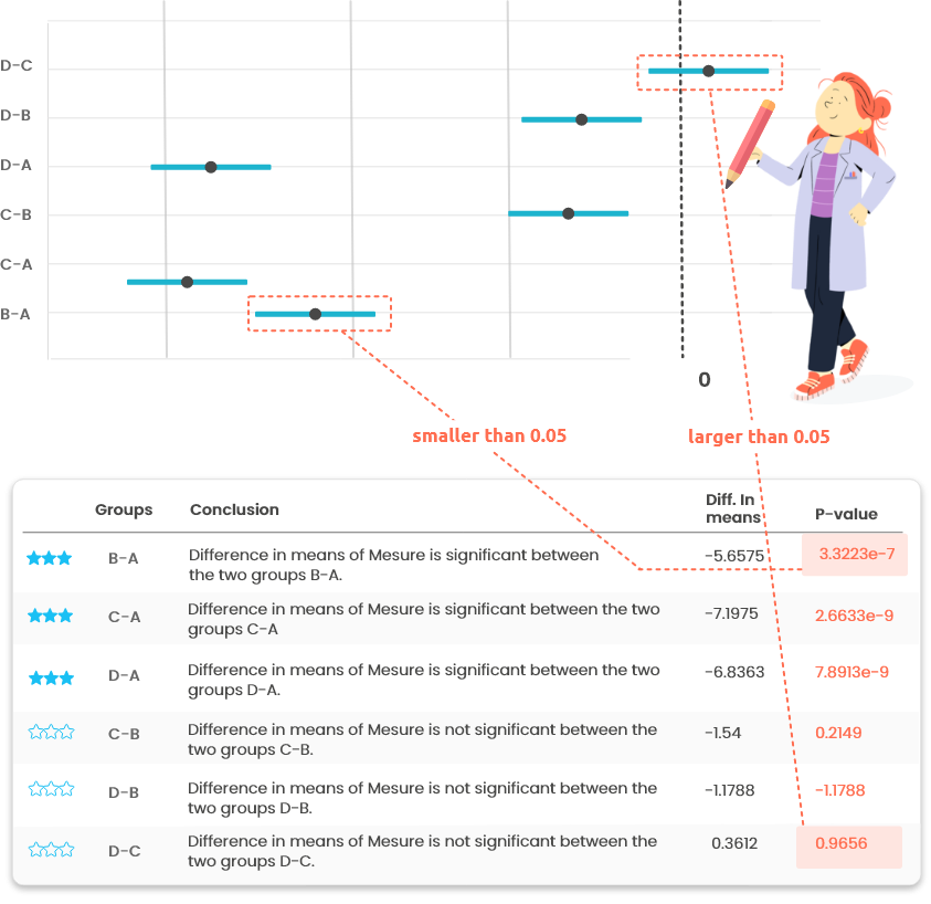
Figure 7.4: Posthoc tests outputs
If the categorical variable has more than two levels, post-hoc tests provide the result of the pairwise comparison tests between levels. See the corresponding graphical output in “Plots.”
7.2.3 Two categorical variables
7.2.3.1 Plots
These plots are three visualizations of the cross table:
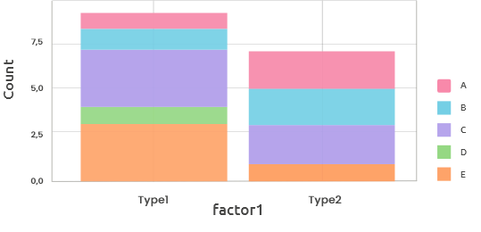
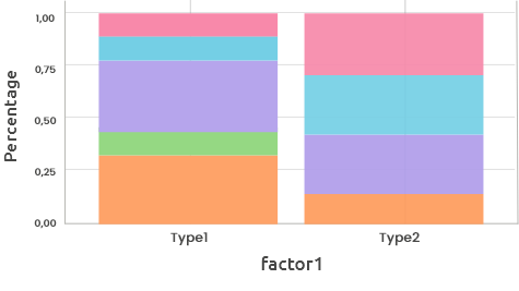
These barplots display either the counts (maximal vertical value = maximal count
for one level) or the frequencies (maximal vertical value = 1) for one categorical
variable (horizontal axis) stacked by the other categorical variable (color).
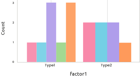
The barplot for counts can also be displayed using several side-by-side bars,
instead of stacked bars. This representation can be useful for the comparison of
counts between levels.
7.2.3.2 Statistical tests
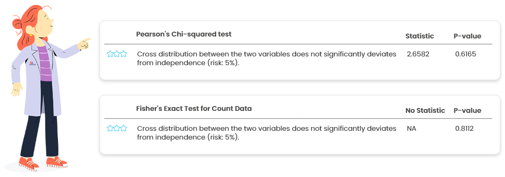
- Pearson’s Chi-squared test and Fisher’s exact test for count data are the two most used tests to check for the independence between two categorical variables.
- Pearson’s Chi-squared test should be avoided when the sample size is small or when some categories are not frequently observed.
- Fisher’s exact test is generally preferable but can be impossible to use when the sample size is large.
7.3 All variables in a dataset
How to set options?
Choose to scale variables (centering and scaling to unit variance) by activating the corresponding option on the left if they have very different scales to obtain readable plots.
7.3.1 Numerical summary

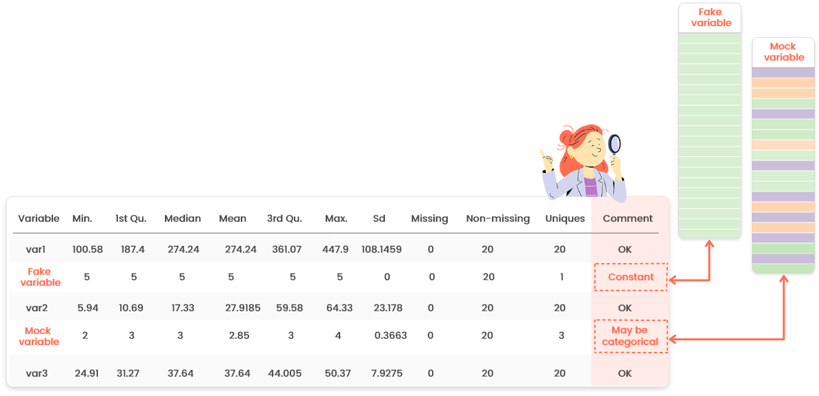
This table contains the same indicators as the numerical summary for one variable
(check the help page in this tab for further information).
Only the last column “Comment” is new: it may warn you about a specific behavior
of some variables. For instance, if one variable supposed to be numeric has only
a few distinct values, it might be categorical. Go in the “Edit” menu to set its
type properly.